A look back at Telecommuting Journal over the years . . .
I’ve been working at home since 1998 and blogging about it since January of 2006 (though I really should have started this blog earlier). When I did finally decide to write about it, I chose a domain name and installed WordPress as my blogging platform. Since then, it seems I suffer from restless WordPress theme syndrome (hereafter known as RWPTS). In case you didn’t notice, I’ve changed things up again!
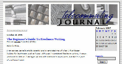
When I first started this blog, I didn’t really put a lot of time or effort into the looks of things beyond finding a theme I loved and tweaking it with my own images. Back then, this blog looked like this . . .

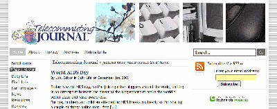
Then, a couple years ago, I decided I needed to update the look of my site by finding a more versatile WordPress theme. I found one, tweaked it all to pieces, and was happy. I liked having the internal page layout different from the front page, but I didn’t like having to maintain them. Still, I loved the new theme and figured I was going to stick with it for years and years. At the beginning of 2008, Telecommuting Journal looked like this . . .

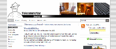
About a year later I felt my blog was looking stale again but I still liked the theme I was using. So I decided to update things by getting a unique logo image. I don’t draw well and I wanted a fresh perspective so I found a guy who was willing to make some hand-drawn sketches for me. He gave me an entire sheet of sketches and I decided to go with the simple house on top of the world that you see in the upper left corner. It just made sense. I love working from home so much that I often do feel like I’m sitting on top of the world. And it just so happens that my house sits on a hill, so it’s doubly apt for me. While I didn’t replace my theme, I did mess around quite a bit with Logos & Headers & Fonts, Oh My. By the end of 2008, this website looked like this:

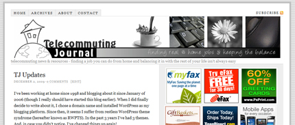
It’s been nearly a year since I updated the look of this blog and nearly 4 since I changed the theme and here I am now with a brand new theme that I’m absolutely loving. I’ve revised the header myself, too. I love coffee and daisies – can you tell? For the record, in December of 2009, Telecommuting Journal now looks like this:

I’m very happy to have the fresh look and the fresh new layout, and I’m really hoping my RWPTs won’t flare up again until at least the fall of 2011!
I love to get feedback on design issues – so I’ll also mention that constructive criticism is welcome, mean remarks are ignored and SpAm is always deleted!

I’m impressed you have time to have RWPTS! But I know what you mean. I find it is difficult to commit to a look because then something else seems to work a little better. It’s fun but time consuming. I like the balck and white header. It’s crisp.
.-= Michele´s last blog ..Sick kid = little work =-.